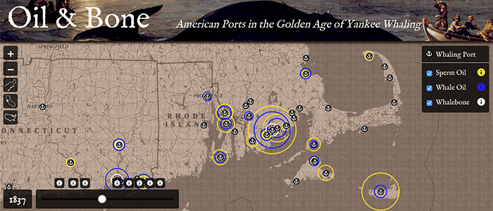
Oil & Bone
This map uses data from the American Offshore Whaling Voyages Database to show the economic impact of whaling in American ports during the industry's 19th century "Golden Age."
Winner of the 2018 NACIS Student Dynamic Map Competition
Featured at whalinghistory.org
Tech: Leaflet
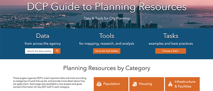
DCP Guide to Planning Resources
This website, designed with and for NYC City Planning staff, organizes the agency's most important data, analytical tools, and reference materials, improving accessibility and facilitating better intra-agency collaboration. Currently available to City Planning staff only.
Tech:

Hallie & Kerry in Southwest Africa
In the summer of 2018, we spent two weeks traveling in Namibia and South Africa. See the stunning landscapes, incredible wildlife, and great friends that made this trip so memorable in this photo album map.
Tech: Leaflet
JavaScript
jQuery
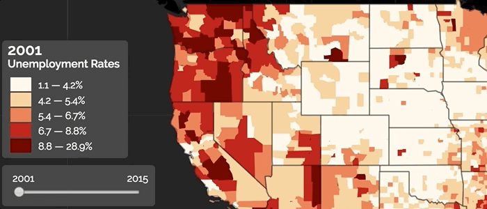
Unemployment in the US
Tracing unemployment rates across the US from recession to boom to recession, this map illustrates the volatility of the US economy from 2001 to 2015. Beneath the high-level trends, the map exposes regional and local stories, like stability amid national crisis, or crisis amid national recovery.
Tech: Leaflet JavaScript jQuery Chroma.js PapaParse
View Project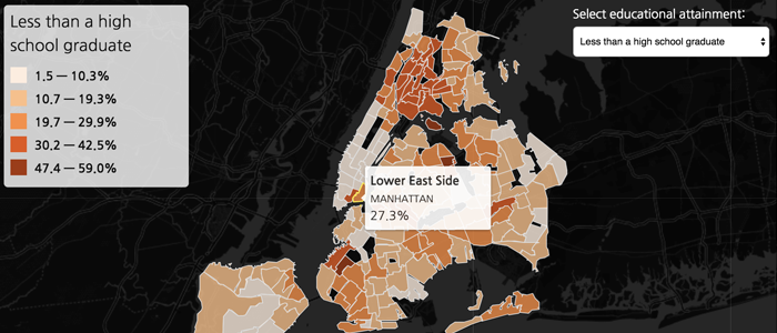
NYC Educational Attainment
While inequality in New York City is typically discussed in terms of income, it shows up in myriad other social conditions. This map explores educational attainment levels in a city where neighborhoods in which 8 in 10 adults have finished college are a short train ride from areas where over a quarter of adults have less than a 9th grade education.
Tech: Leaflet
JavaScript
jQuery
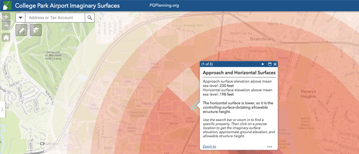
College Park Airport Imaginary Surfaces
This app, which I built for the Prince George's County Planning Department, identifies the limits to building heights in the fast-growing area around an airport in College Park, MD.
Tech: ArcGIS Desktop
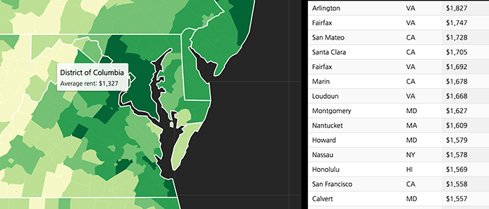
The Rent Is Too Damn High
This map examines the average cost of rent across the US using data from the American Community Survey. A searchable table built with the DataTables jQuery plug-in complements the map.
Tech: Leaflet
JavaScript
jQuery
DataTables
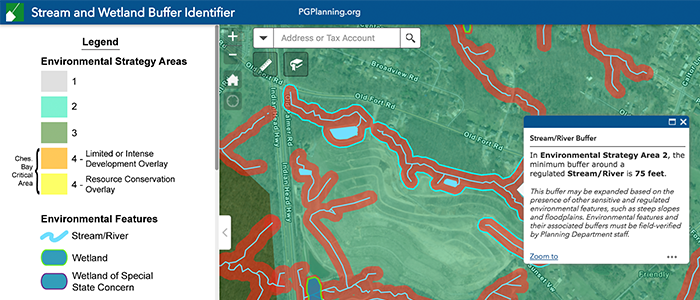
Stream & Wetland Buffers
This application helps homeowners, farmers, and developers in Prince George's County, MD, understand complex regulations protecting streams and wetlands, and how their property may be affected.
Tech: ArcGIS Desktop
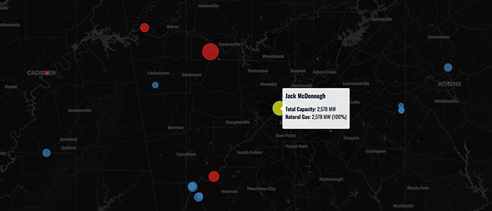
Fossil Fuel Power
In spite of intensifying global climate change, 63% of the electricity produced in the U.S. in 2017 was generated by burning fossil fuels. This map shows fossil fuel power plants and their megawatt capacities according to the U.S. Energy Information Administration's Form 923.
Tech: Leaflet JavaScript
View Project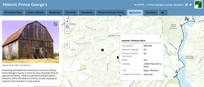
Historic Prince George's
Working with the historic preservation team in the Prince George's County (MD) Planning Department, I built this interactive map to make data on historic sites and districts both more accessible and more compelling.
Tech: ArcGIS Desktop
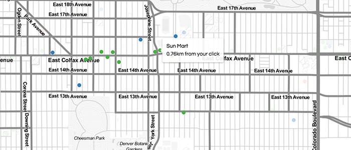
Homebuyer's Guide to Denver
When prospective homebuyers evaluate a neighborhood, they have a lot to consider. This application maps three community assets of interest to a particular homebuyer in Denver: food stores, after school programs, and fire stations. A click on the map highlights assets within 1 km of the click.
Tech: Leaflet JavaScript
View Project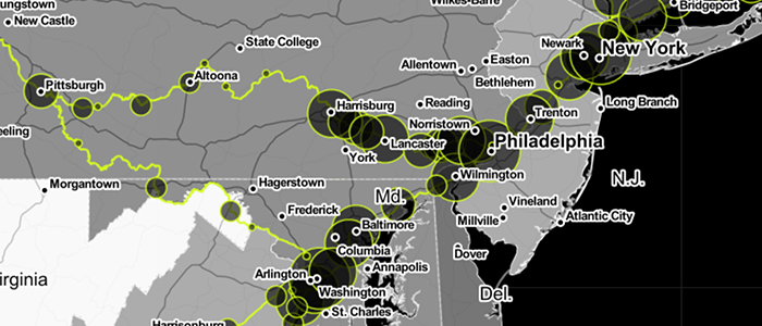
Amtrak Usage by State & Station
Using data scraped from Amtrak's 2017 State Fact Sheets, this map compares Amtrak ridership at both the state and city levels. Zoom in to activate proportional symbols indicating boardings and alightings at each Amtrak station.
View Project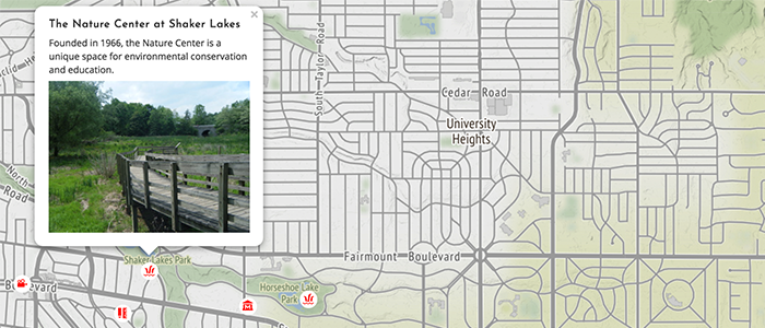
Welcome to Shaker Heights
Here's a lighthearted look at the place where I grew up, including some personal points of interest and background information on the town. If you get bored in the suburbs, follow a route to the perfect day in nearby Cleveland.
Tech: Leaflet JavaScript jQuery
View ProjectAbout Me

I'm Kerry Gathers. I'm a consultant with Esri, and I help our customers in New York City government agencies make the most of our technology to solve some of the City's greatest challenges. I previously worked as an analyst with the NYC Department of City Planning, where I leveraged the agency's data and expertise to help planners work more effectively and empower other city stakeholders to participate in the planning process. Before coming to NYC, I spent four years leading GIS projects in the Countywide Planning Division of the Prince George's County (MD) Planning Department.
I have a BA in sociology and MA in geography from the University of Georgia, and a graduate certificate in web mapping from the University of Kentucky's New Maps Plus program.
I live in Brooklyn, NY, and have a very good dog named